
.svg)
.svg)
.svg)


Building one system for daily sports facility operations
Running a sports facility means managing bookings, staff tasks, payments, available spaces, and customer requests at the same time.
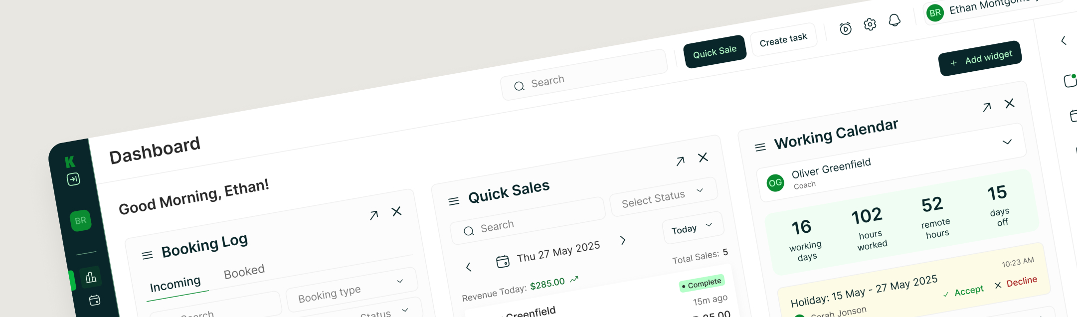
KICKS brings these workflows into one configurable dashboard, helping facility managers understand what needs attention and act without moving between disconnected tools.
Structuring operational complexity into one product
.svg)
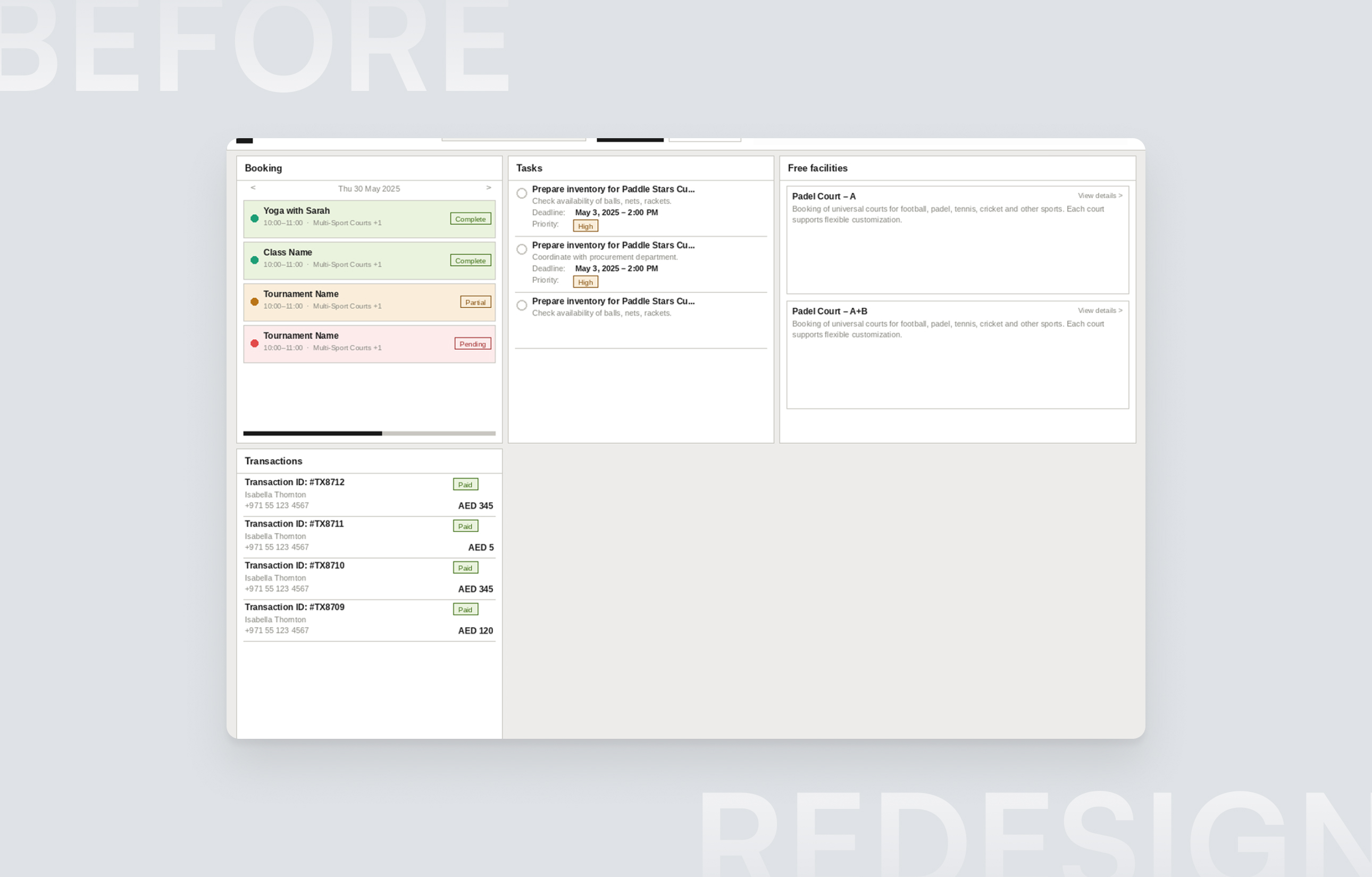
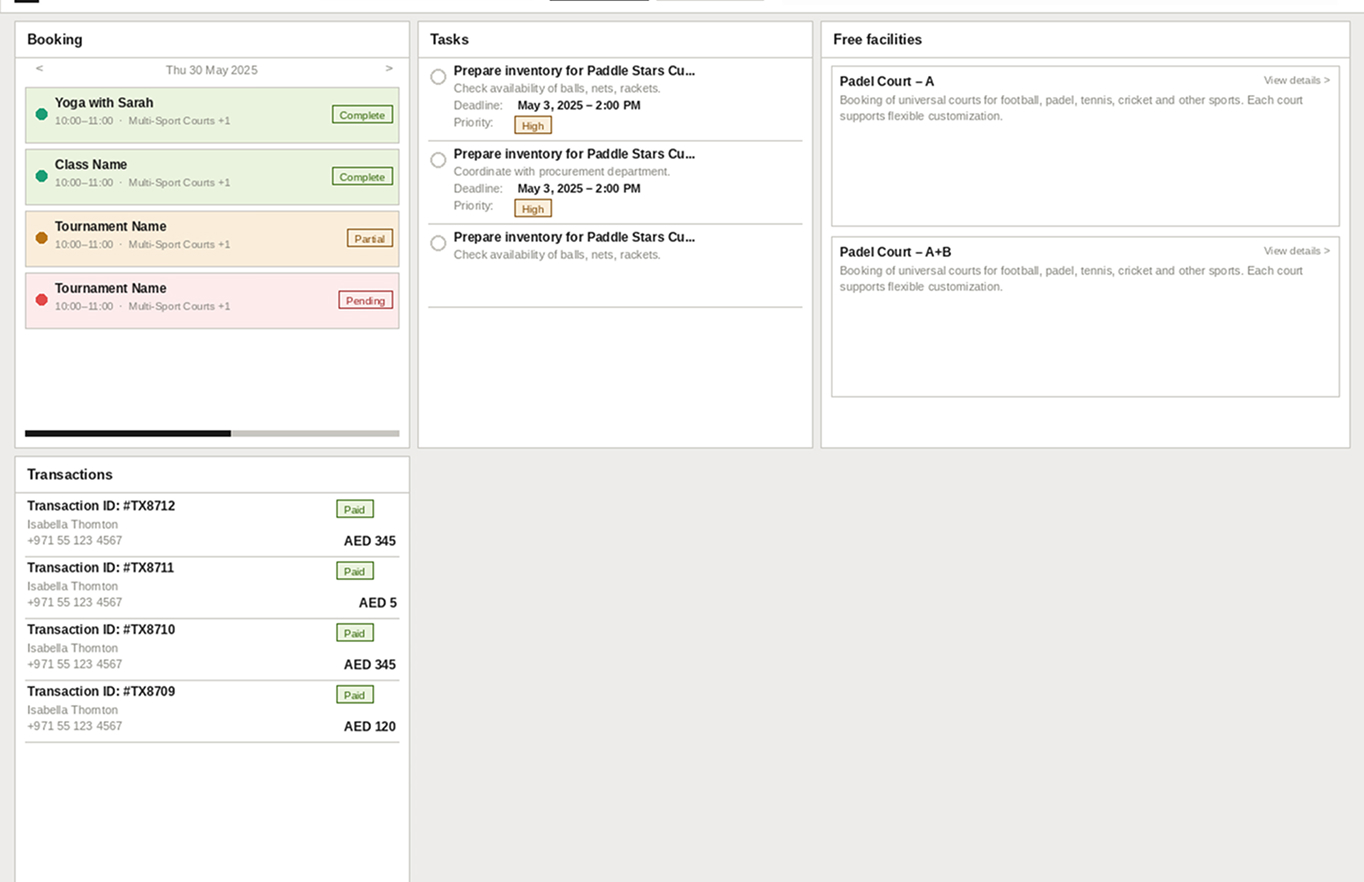
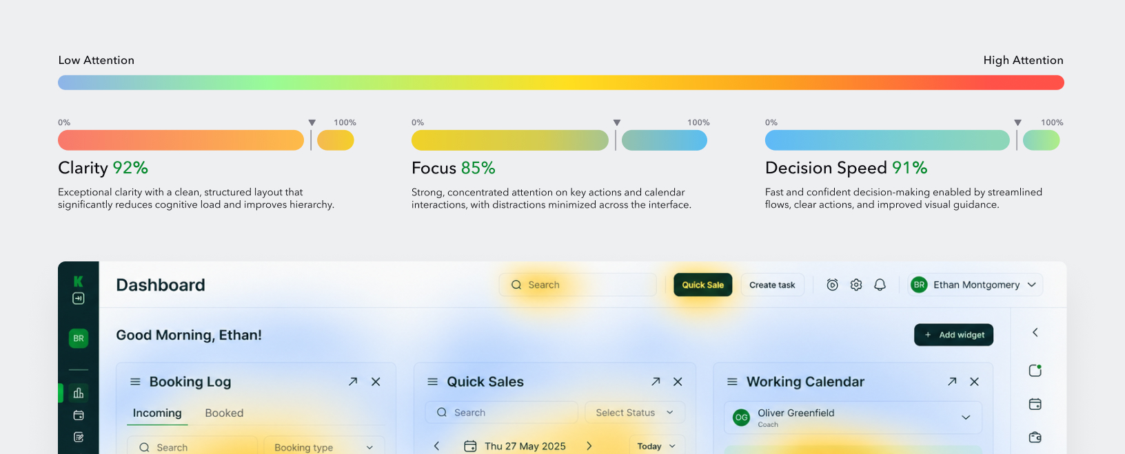
The platform had to support several workflows without turning the dashboard into a dense reporting screen. Managers needed to review incoming bookings, follow team tasks, monitor transactions, identify available facilities, and access frequent actions quickly.
The UX challenge was to give each workflow enough detail while keeping the overall experience easy to scan.
Turning complex workflows into a scalable UX/UI system
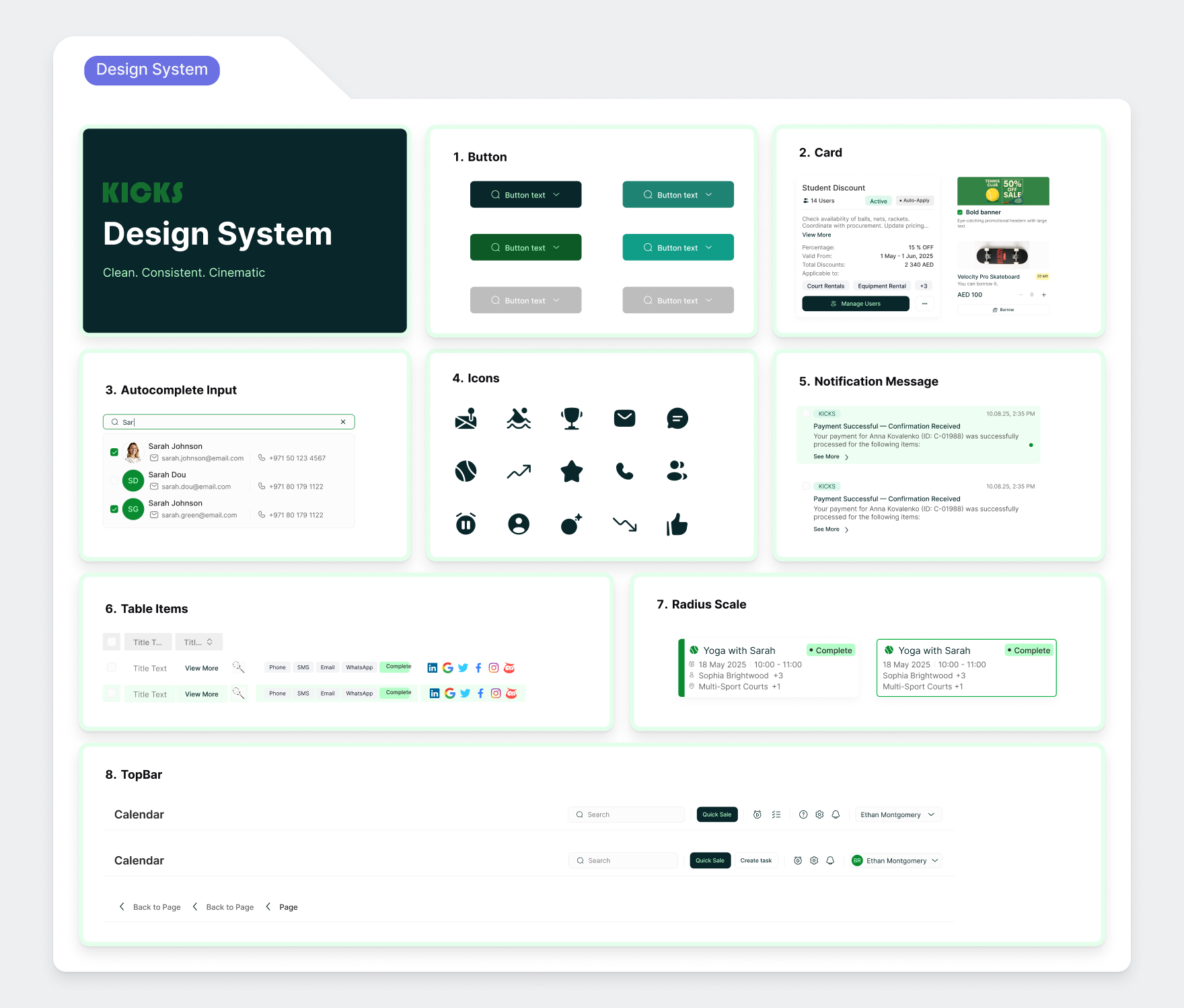
We transformed KICKS’ operational scope into a structured product experience connecting IA, wireframes, AI prototypes, brand foundation and a scalable design system into one coherent platform that is ready for development and long term growth.
Not ready to book a call yet?
Take a quick tour of how we work, what to expect, and how UXRS can support your product before starting a project.
Building a clear foundation for a complex B2B product
We worked from operational structure to interface detail, focusing on how different types of facility data could live together without competing for attention.
Competitors Research & Benchmark

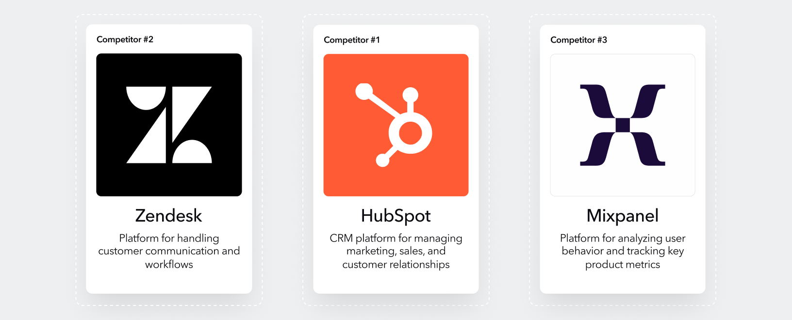
We reviewed B2B booking and facility management products such as Zendesk, HubSpot, Mixpanel to understand common patterns for operational dashboards, scheduling, payments and task management.
The goal was to identify familiar interaction models that could reduce the learning curve while leaving room for KICKS-specific workflows.
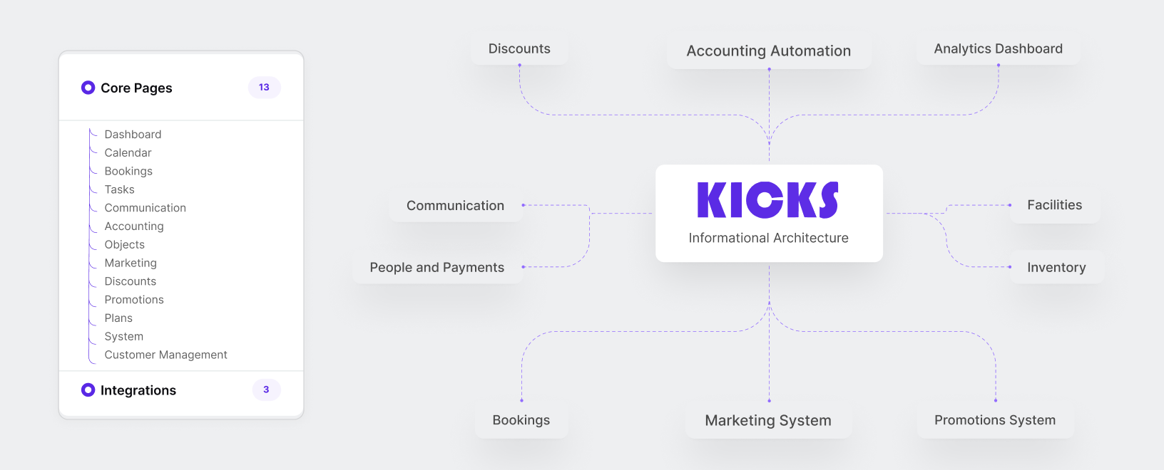
Information Architecture
KICKS had 18 features across bookings, CRM, payments, and operations. We organized the platform around the main areas facility teams work with every day: bookings, tasks, payments, facility availability, and quick actions. This created a clearer relationship between dashboard information and the deeper management workflows behind it.
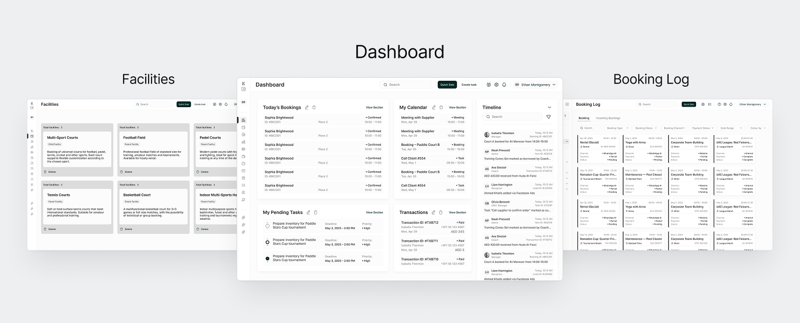
Wirefaming
With structure defined, we translated every flow into detailed wireframes — screen by screen, state by state, ready for the client to review and react.
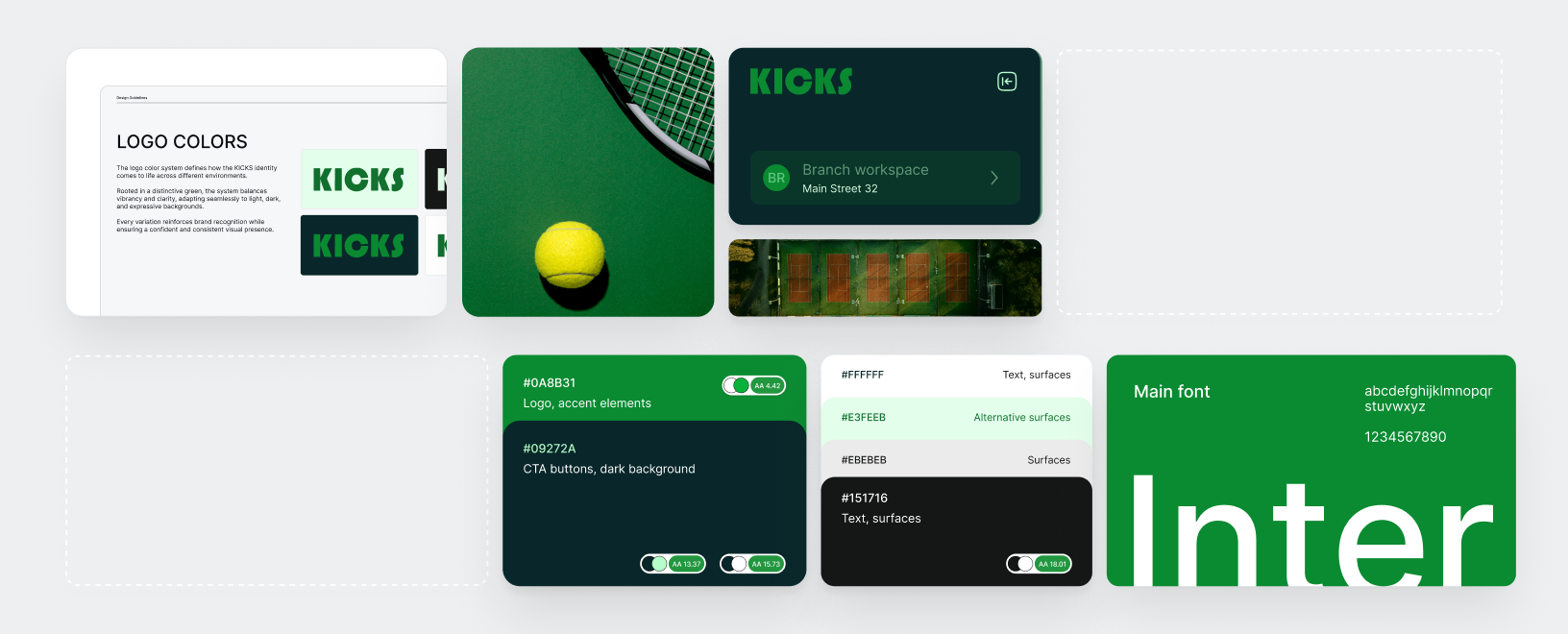
Brand Foundation
KICKS needed a visual identity that felt professional and trustworthy for both facility owners and athletes. We built it from zero typography, color system, and brand logic that scales across the entire product.
User Testing
We conducted user testing sessions, analyzed user behavior, and translated the findings into clear UX metrics.
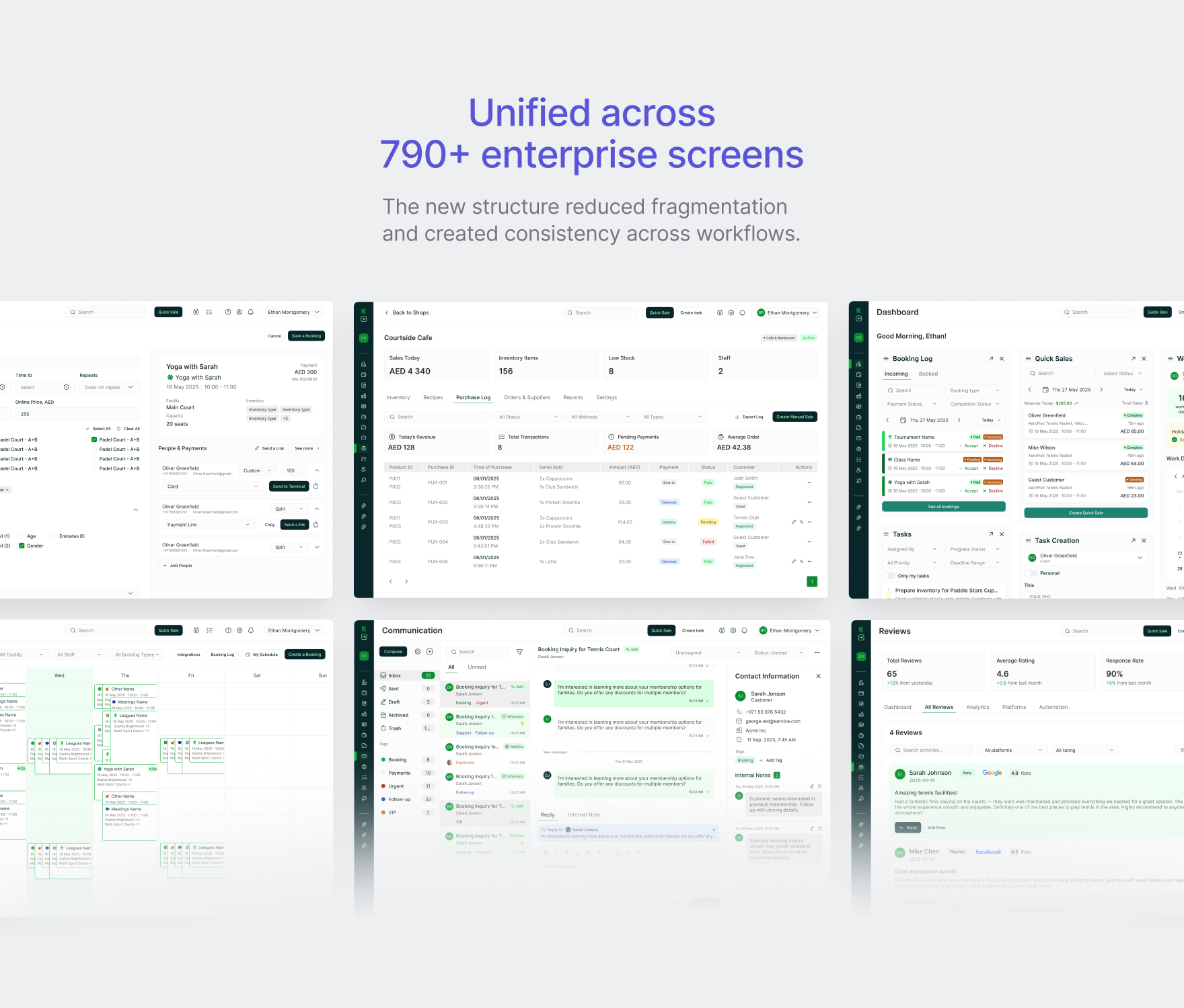
Unified across 790+ enterprise screens
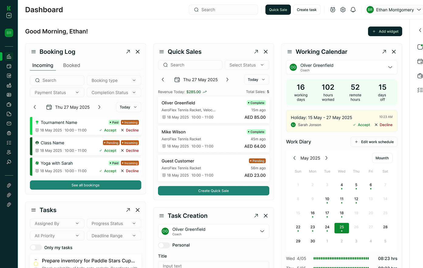
KICKS turns bookings, tasks, payments, and facility availability into one connected operational view. Instead of treating the dashboard as a passive summary, the experience supports direct actions: managers can review requests, manage work, monitor transactions, and access common tools from the same workspace.
The modular structure also gives the product room to support different facility types and operational priorities as the platform grows.
Facility teams shouldn’t have to search across different screens to understand what needs attention. We designed KICKS around one idea: put the right operational context next to the action it supports.
Start a conversation
Tell us about your product or challenge and we’ll help you move it forward.
.svg)
Other ways to connect
You can also connect with our team through social platforms and follow our latest design work and updates.
.svg)
.svg)

.svg)

.svg)
.svg)
.svg)

.svg)